When you think of Coca-Cola, the red hits your mind before the logo does. When you see the golden arches, you don’t need to read the word McDonald’s to know what it is. That is the power of psychology in design colors and typography to shape how people feel, remember, and trust a brand.
In today’s digital-first world, where consumers are bombarded with endless options, brand recognition has become the real battlefield. The subtle choices in your design, the shade of your palette, the weight of your font, the spacing of your letters determine whether people stop, engage, and remember.
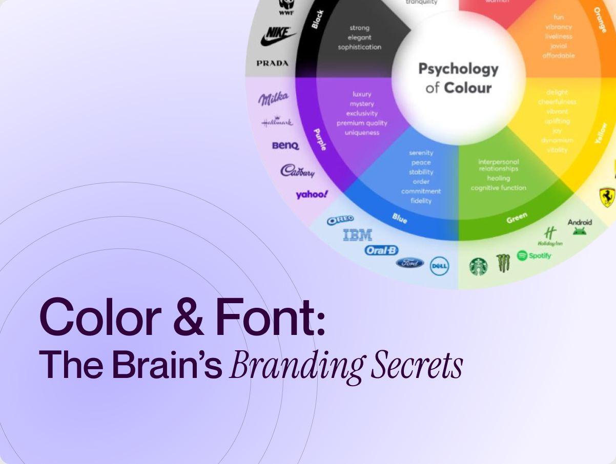
Why Color Matters in Branding
Color is not merely decoration, it is communication. Research shows that effective use of color can increase brand recognition by as much as 80%. Blue conveys trust and professionalism, often associated with financial and technology leaders. Red evokes excitement, urgency, and appetite, making it a favorite for consumer brands. Green reflects growth and sustainability, a natural fit for companies aligned with wellness and the environment
When a startup chooses colors randomly, it risks blending into the noise. But when chosen intentionally, color becomes an asset that shapes emotion and builds recall.
The Role of Typography
Typography is another silent persuader. Serif fonts feel traditional and authoritative. Sans-serif fonts feel modern and approachable. Bold fonts scream confidence, while script fonts whisper creativity and elegance.
Typography influences not just what people read, but how they feel about the message. Imagine a luxury skincare brand using Comic Sans. Trust would vanish instantly.
Spotify’s rise offers a perfect example of color and typography psychology at work. In a crowded streaming industry, Spotify distinguished itself with a vibrant green that instantly signals freshness, growth, and innovation. The circular logo and clean sans-serif typography reinforce approachability and digital-first thinking.
More importantly, these choices work consistently across mobile apps, billboards, and campaigns. The result? Spotify is more than a product; it embodies energy and personalization. Its identity is so distinct that consumers recognize it instantly, even without the name.
- Choose colors strategically. Don’t pick your favorite shade; pick the one your audience will emotionally connect with.
- Be consistent. Use your chosen colors and fonts across all touchpoints, website, packaging, social media.
- Think about memory. People won’t always remember your tagline, but they will remember your colors and typography.
- Test with your audience. Small A/B tests on color or font changes can reveal what builds stronger trust.
Why This Matters
In a world where attention spans are shrinking, design psychology is your shortcut to memorability. A strong logo is not enough; the color and typography behind it determine if your brand becomes a household name or fades into the background.
At Leen Design Studio, we help founders unlock the hidden psychology behind design, turning abstract choices into growth assets. Because recognition isn’t accidental it’s engineered.
Links:
Linkedin | https://www.linkedin.com/company/leendesignstudio
Instagram | https://www.instagram.com/
Website | https://leendesignstudio.com/
Facebook | https://www.facebook.com/LeenDesignStudio/
Email | hello@leendesignstudio.com
Contact | +1 (202) 550 4844